BRANDING
LOGO DESIGN
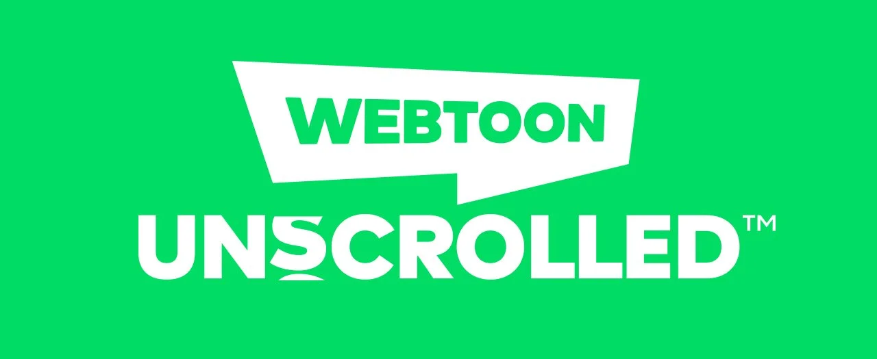
WEBTOON UNSCROLLED
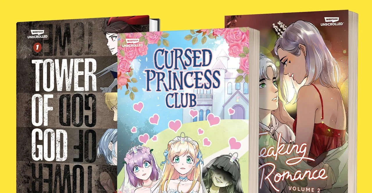
In 2021, WEBTOON sought out to start their own graphic novel imprint. After several other WEBTOON comics had found commercial success adapting themselves into printed media, such as the critically acclaimed Lore Olympus, WEBTOON wanted to secure publishing rights for their other popular comics and enter the industry themselves.
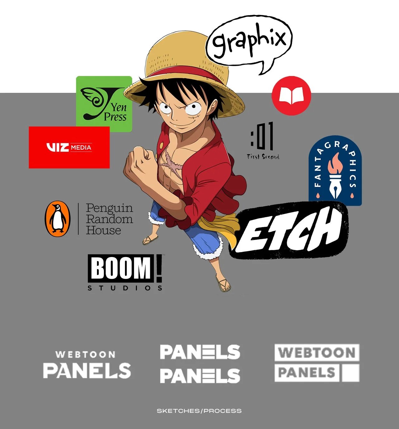
Several other graphic novel imprints and companies already existed at this point, with many existing for decades before WEBTOON wanted to enter the space. It became paramount to understand the current market in order to identify what creates a successful brand, but also to separate ourselves from our competitors.
During our early explorations for the brand, the name for the imprint was still not finalized. Multiple names such as “Panels” and “Illuminated” were thrown around, but even early sketches showed that we needed our logomark to be as expressive as WEBTOON comics themselves. We needed the logo to be imbued with meaning and spirit to communicate the intent of the emerging brand. We needed to paint with words, like our artists already did with pictures.
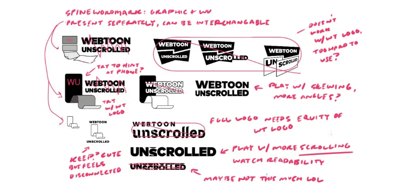
Alot of early explorations avoided the WEBTOON logo entirely. However, in attempt to make the brand as proprietary as possible, we needed to use it. For a variety of reasons, we did not want to do this.
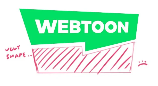
The regular WEBTOON logo was already difficult to work with, but at least it’s proportions were relatively square. The horizontal WEBTOON logo is long, and thus it demanded respect. The frame WEBTOON sits in is sharp and angular, with harsh corners and sides. This made it difficult to create a corresponding frame whenever we tried. No matter the configuration, the spike at the bottom made anything who dared graze it’s backside… ugly.
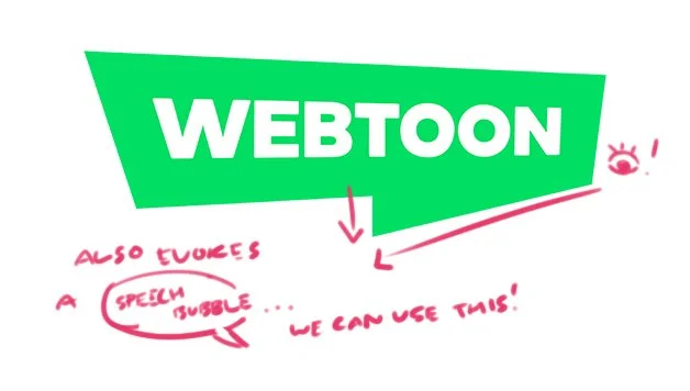
But what if we could use the logo’s drawbacks as an advantage? Instead of forcing ourselves around the shape, we could use these strong angles to make a harmonious logo. The sharp angle naturally leads one’s eye down the logo. The frame even evokes that of a speech bubble, which is pertinent to the medium itself.
This was the key to working with the WEBTOON logo.
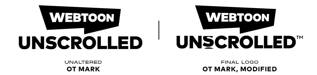
This is the final logo. To express the idea of “scrolling”, the “S” was chosen to scroll in the logo. This is because the “S” starts the second syllable in the word, and it’s round shape would not look weird if a part was obscured. The other letters in “UNSCROLLED” did not lend itself well to the scrolling idea. Originally we had it moving in the other direction, but because you scroll up while reading WEBTOON comics on the phone, this is the direction we landed on.
Furthermore, because UNSCROLLED is such a long word, and the logo would have to scale nicely even when tiny on the corner of a book, I shortened the “LLE” letterforms in “UNSCROLLED.” This was to make the logo less long and allow it to scale slightly larger whenever it can be afforded. It also allowed the tail of the WEBTOON frame to slot nicely in the crook between “R” and “O”, helping the logo feel natural and interact together as a gestalt. Now the word UNSCROLLED was exclaiming the brand: WEBTOON.
COVER DESIGN
LETTERING
LOGO DESIGN
FREAKING ROMANCE
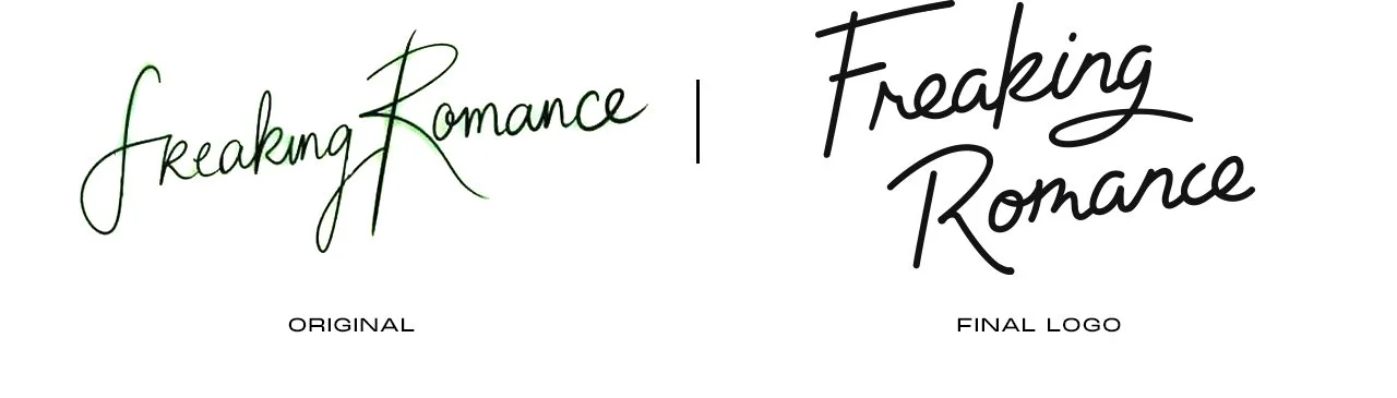
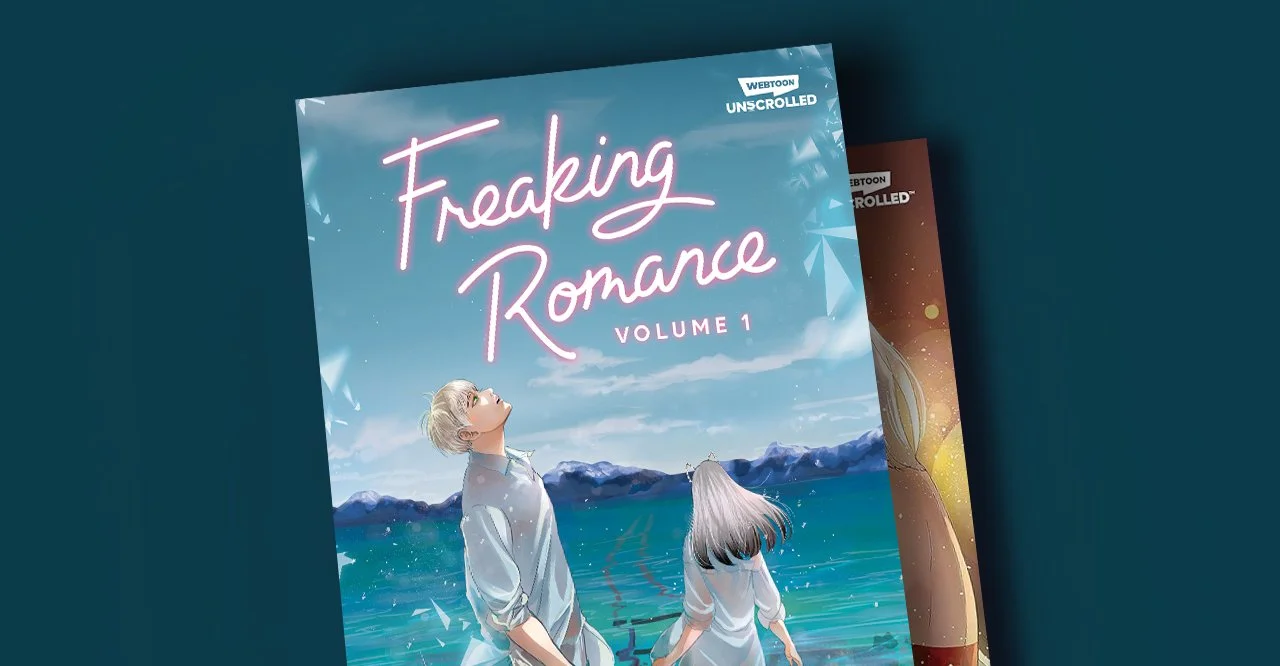
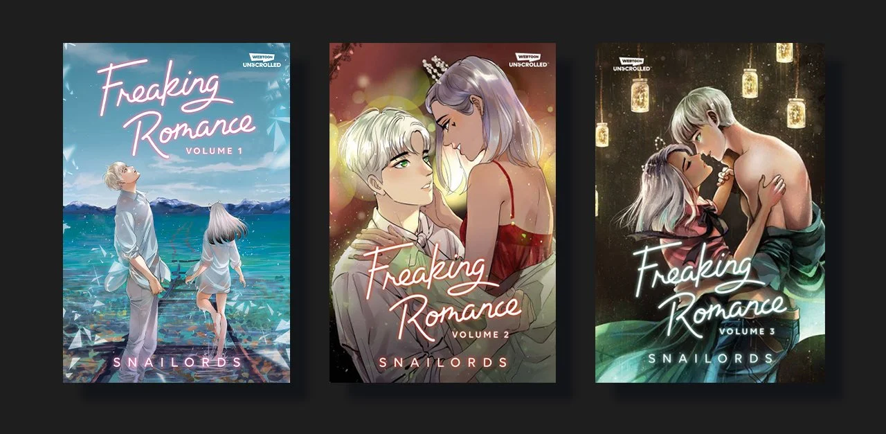
I also had the great honor of redesigning the logo for one of WEBTOON’s classics, Freaking Romance. A romance crossed between dimensions, two lovers must overcome time and space to achieve their happily ever after.
In addition to the logo for Freaking Romance, I helped design the covers for Volumes 1, 2, and 3.
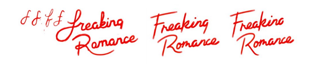
Inspired by moody neon lights and hand-written poetry, I knew I had to hand-write the logo myself.
I tried my best to be inspired by the original comic logo, while still making something that will be bold enough to stand out on store shelves.
COVER DESIGN
LETTERING
LOGO DESIGN
PUBLICATION DESIGN
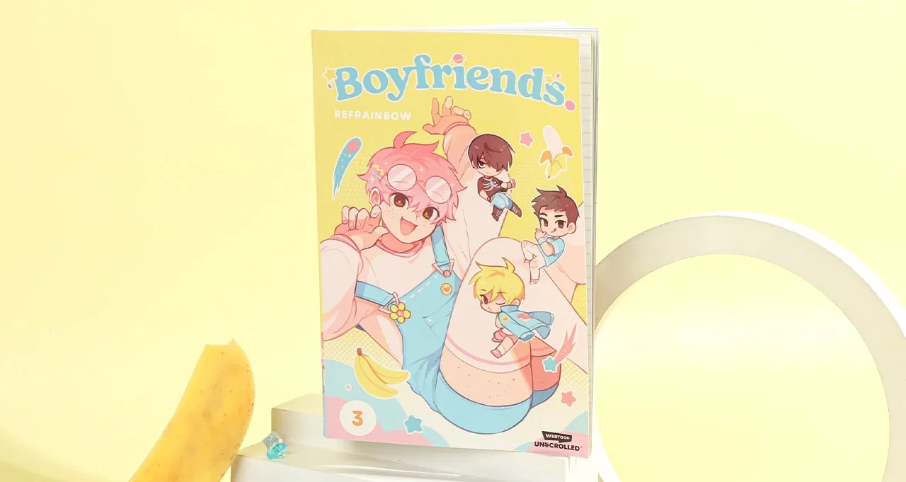
BOYFRIENDS.
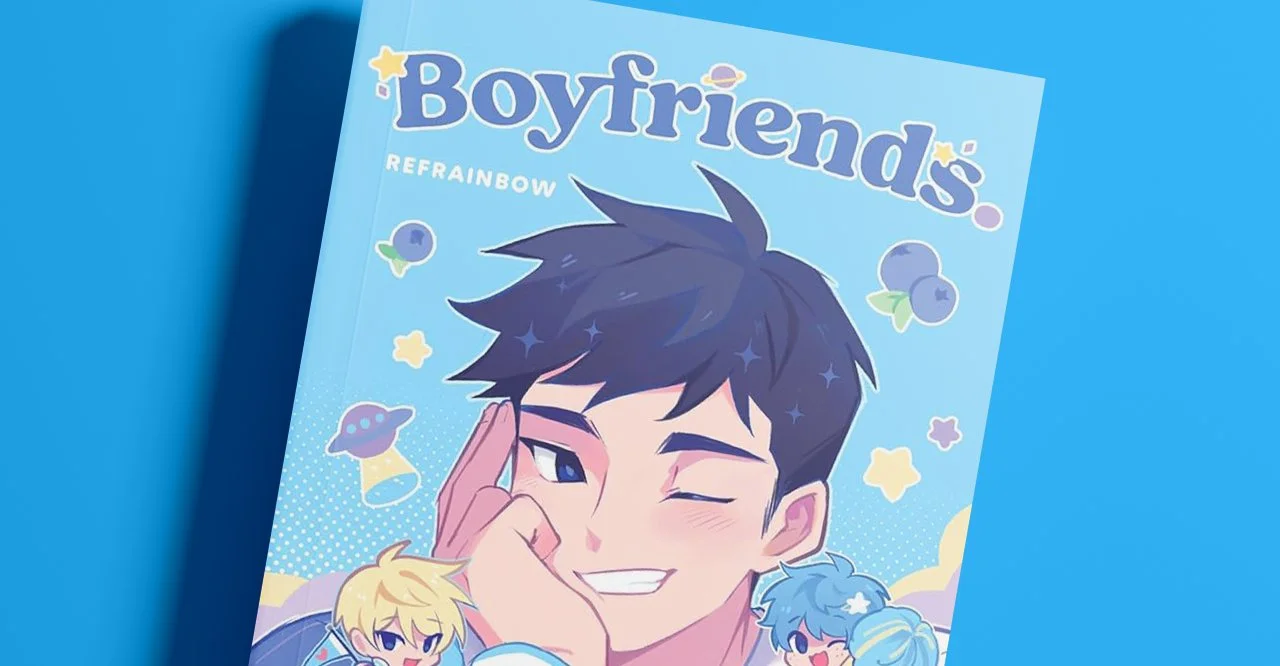
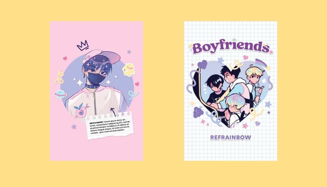
Another one of WEBTOON’s most iconic series, Boyfriends is the story of a group of four boys who fall in love and all became boyfriends. I’ve been a fan of this series for a long time before it even became a WEBTOON ORIGINAL, so I was super excited to work on the graphic novel adaptation.
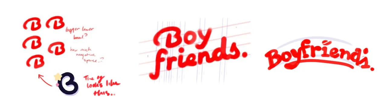
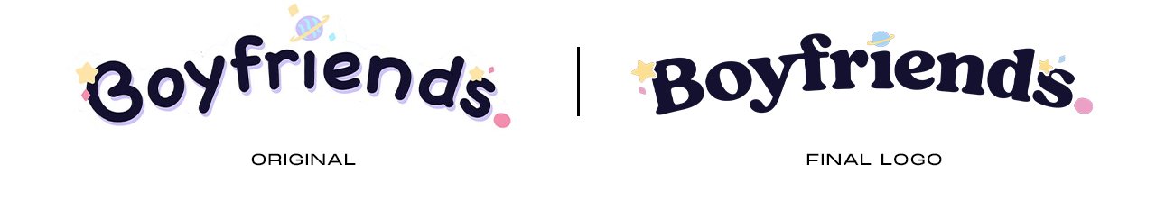
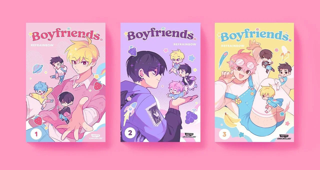
To get the book ready for print, I was entrusted to redesign the original logo with a bolder font so it can assert itself in the bookstore amidst the league of competing romance novels. Additionally, I helped design the covers for Volumes 1,2, and 3.
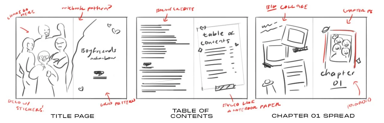
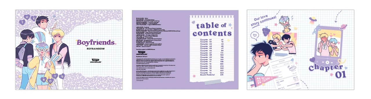
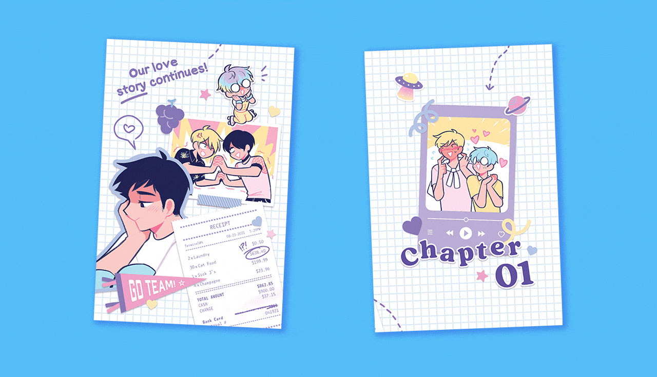
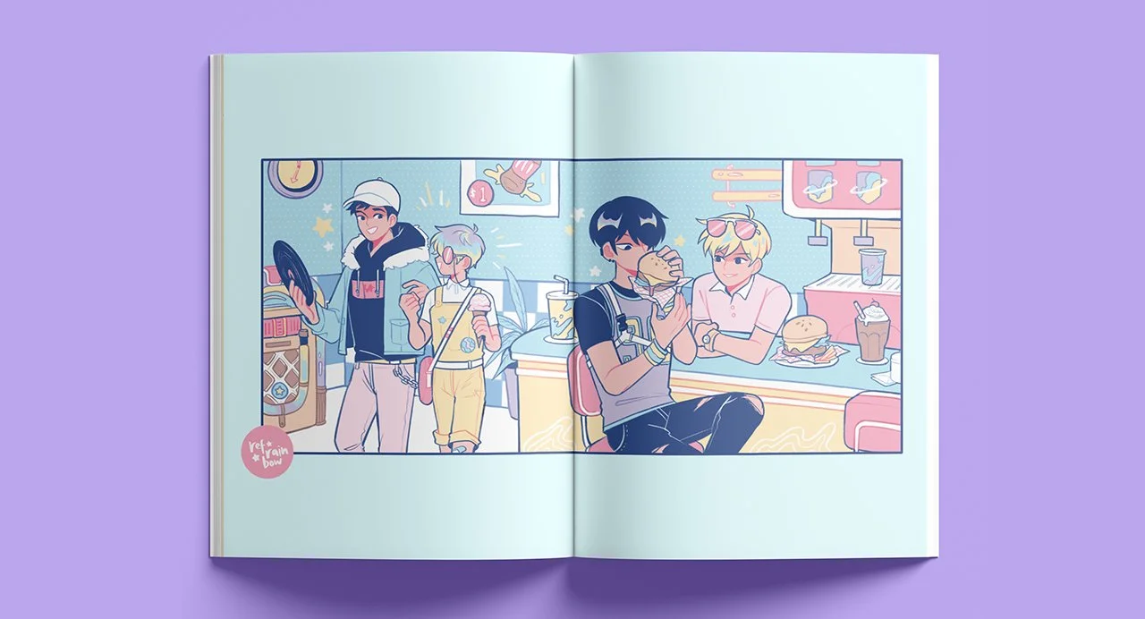
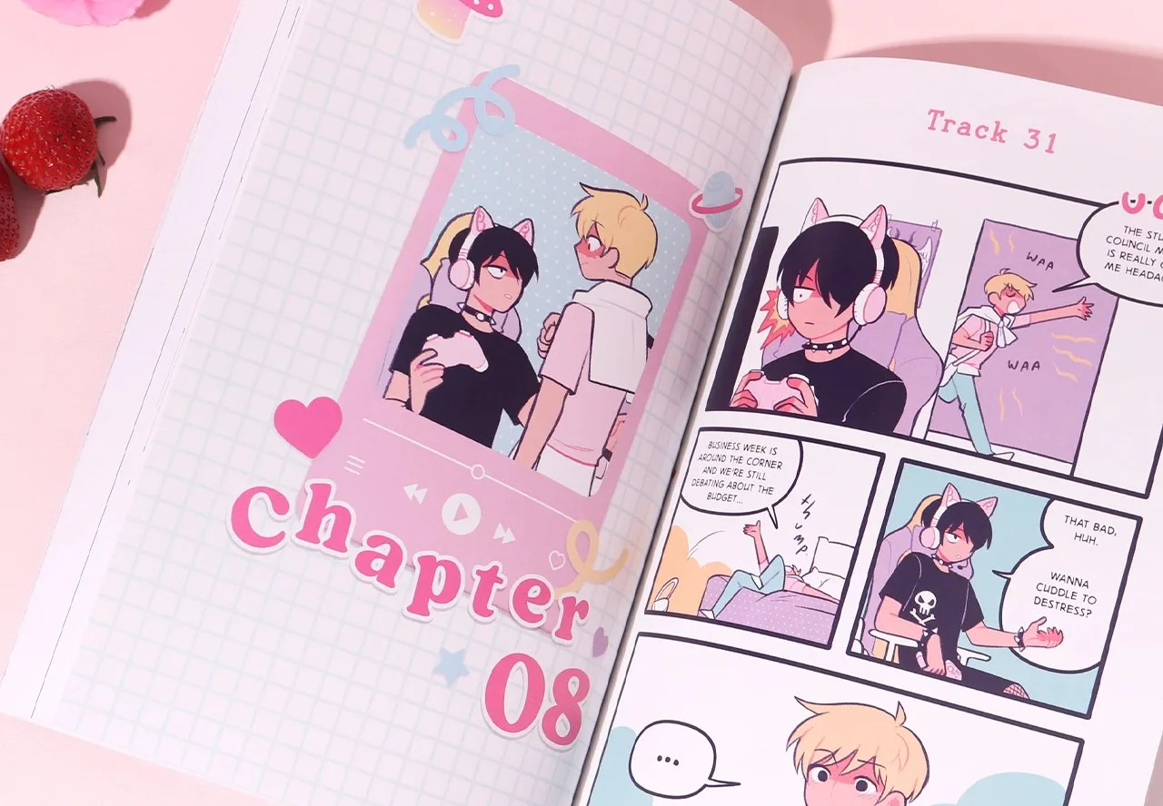
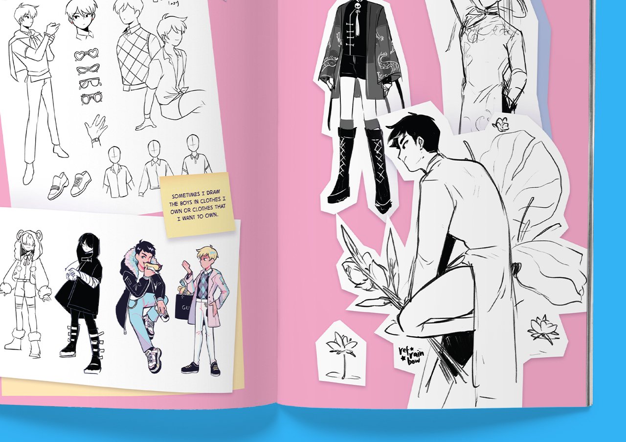
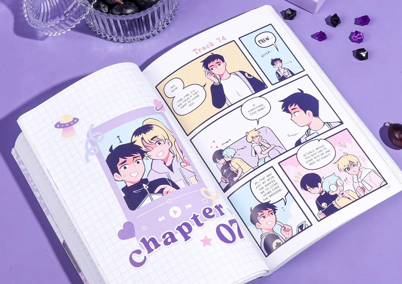
Finally, I was also given the responsibility of designing the interiors for the graphic novel. Although many graphic novels aren’t as decorated or embellished, WEBTOON UNSCROLLED tried to innovate in this space. For my visual direction, I was inspired by the concept of scrapbooking. While literally this book was a graphic novel, I envisioned it metaphorically as a collection of the boy’s memories together.
I did the publication design for Volumes 1 and 2.
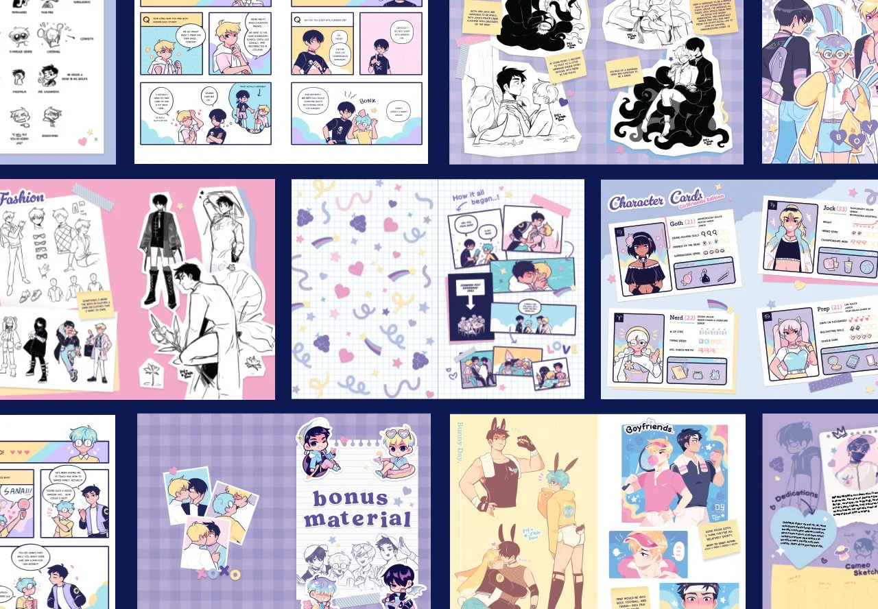
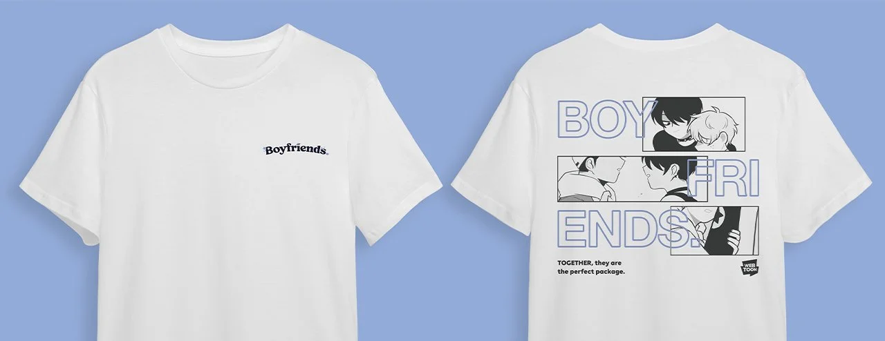
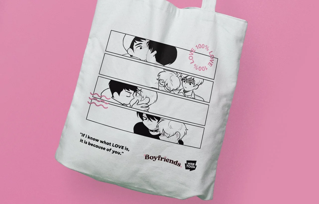
Additionally, I was also asked to design merchandise for the series in the form of a t-shirt and a tote bag. When I design for merchandise, I want to create stylish and casual things I can see myself use daily. Since Boyfriends. is a webcomic, I leaned into the visual language of comics themselves as inspiration. Using the borders to reframe and position the subjects, I interweaved the art with typography and negative space to create a modern and interesting composition.